Your ad clicks are solid, but conversions? Flatlined. The culprit might not be your campaign—it could be your website. If it loads like it’s stuck in 2012 or feels more like a maze than a medical hub, your patients are bouncing faster than you can say “digital diagnosis.”
As a team of digital marketers, designers, and developers, we’ve seen this story play out too often in healthcare. The good news? Fixing it is entirely within reach.
The healthcare sector never stands still—and neither should your website. Patients expect seamless online experiences that feel as intuitive as ordering groceries or hailing a ride. If your site can’t keep up, it’s not just costing you traffic—it’s quietly eroding trust.
And here’s the real twist: in healthcare, trust is the conversion.
Patients today don’t want to wait on hold or navigate clunky interfaces. They want:
We’re past the age of “click here to call us.” It’s now “let me book a consult before my coffee brews.”

Mobile-first isn’t just a tech buzzword. It’s where your patients live. Over 60% of health-related searches start on phones, and telehealth has gone from nice-to-have to non-negotiable.
Regulations like HIPAA (in the US), NDHM (in India), and ADA aren’t just legal frameworks—they’re what keep your site usable and safe for everyone. Miss these, and you’re not only risking lawsuits—you’re turning away patients.
An old, clunky design doesn’t say “legacy.” It says “we don’t invest in experience.” Would you trust a heart surgeon who shows up in sandals?
Good UX isn’t about fancy sliders. It’s about helping a worried parent find the pediatrician tab in two seconds flat. Simpler flows = happier patients.
We once rebuilt Mejocare.com, which originally took 12 seconds to load. After redesigning it in React, it dropped to under 2 seconds. That single shift improved bookings by 35%.
“Fast sites build trust. Slow ones cost you patients.”
Frontend Lead, Pixshop.design
Modern typography, clean visuals, and subtle animations do more than impress—they reassure. When paired with HTTPS and secure forms, patients feel safe.
Redesign is an SEO opportunity. Structured content, schema markup, compressed media—it all helps Google (and patients) find you faster.
Integrations aren’t luxuries anymore. We’ve helped clients plug in:
The easier you make it, the more likely they’ll return.
From font contrast to form encryption, every detail matters. Redesign helps bake compliance into the very core.
Blogs, FAQs, symptom checkers—they all keep patients engaged long after their first visit. And the right content strategy can turn one-time visitors into brand advocates.
No more “Services” dump pages. Each specialty gets its spotlight—with doctor bios, FAQs, and appointment CTAs.
Urgency doesn’t wait for five menu clicks. We place emergency numbers and booking buttons right where patients need them.
Larger text. Voice-read buttons. Minimal motion. We design for real humans—not just Gen Z on fiber internet.
We break up jargon into readable chunks. Think short paragraphs, verified sources, and helpful visuals. Like health literacy—but friendly.
We break up jargon into readable chunks. Think short paragraphs, verified sources, and helpful visuals. Like health literacy—but friendly.
Schema helps search engines understand your content. We tag everything—doctors, procedures, FAQs—so you show up for more searches.
Location pages. GMB integration. Nearby keywords. Because ranking for “orthopedic surgeon in Mumbai” beats ranking for “orthopedic stuff.”
From image compression to lazy loading, our developers squeeze every millisecond out of your site load
Patients trust those who educate. We help you launch a blog (or revive it) with well-written, medically reviewed content.
It’s 2025. If your site still says “Not Secure,” we need to talk.
Your forms aren’t just HTML—they’re patient entry points. We secure every field.
From firewalls to failovers, we recommend hosting that doesn’t panic when traffic spikes.
Whether targeting patients from Nairobi or New York, your site needs to play by the right privacy rules.

We’ve built and rebuilt platforms for brands like Mejocare and MedEasy Healthcare, balancing UX with compliance.
We design with rules in mind, not as afterthoughts.
Want proof? We’ve got launch stats, testimonials, and before/after metrics to share.
Redesigns aren’t “set it and forget it.” We stick around—for bug fixes, tracking setup, SEO, and new features.
Every 3–5 years—or sooner if you notice poor performance, low engagement, or tech limitations.
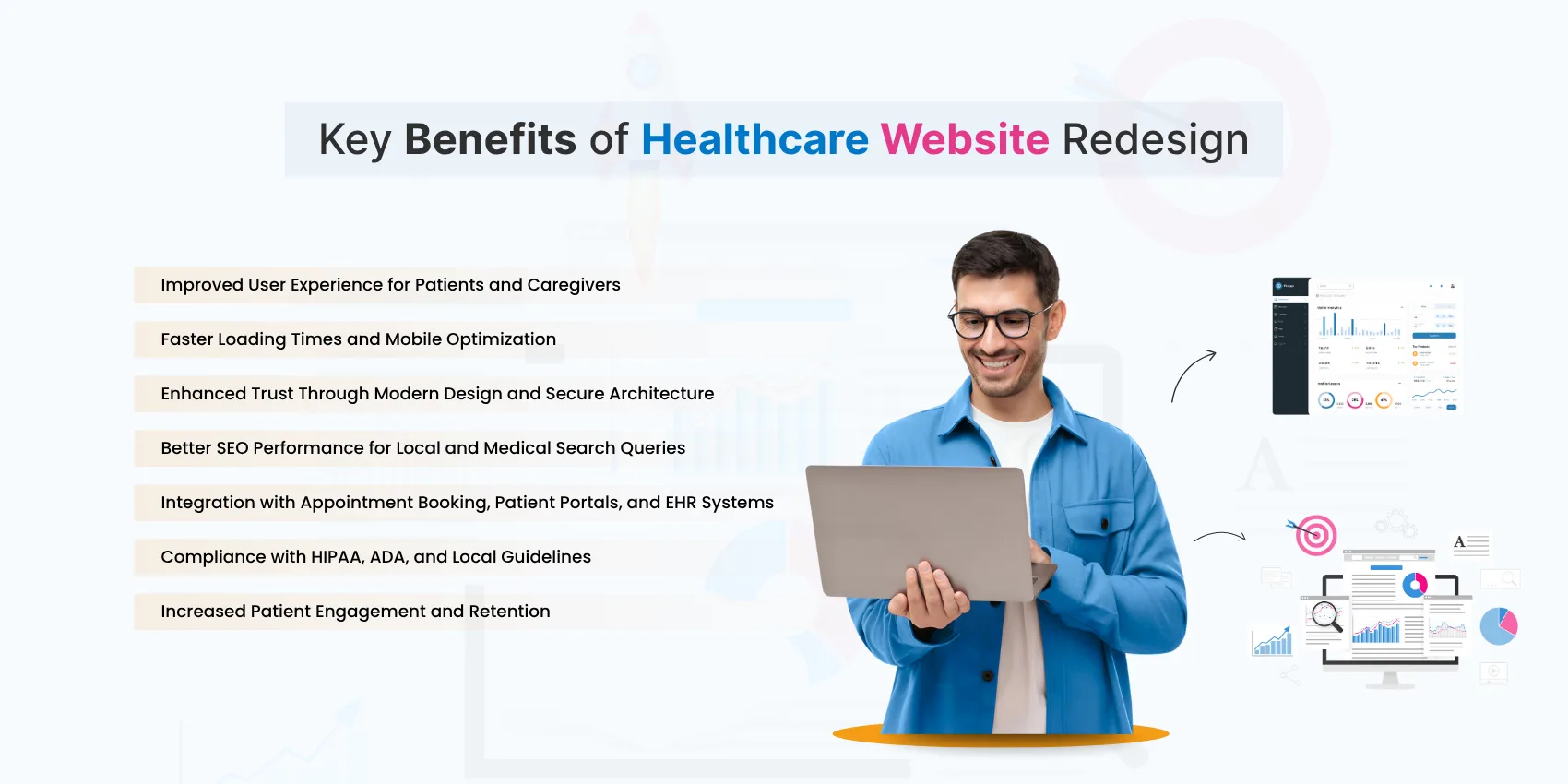
Speed, security, mobile UX, appointment integrations, clear info, and compliant design.
Depending on scope, anywhere from ₹60,000 to ₹2.5 lakh. Think of it as an investment, not a line item.
Done right? It boosts rankings. We preserve URLs, set up redirects, and retune every page.
Redesigning your healthcare website isn’t a vanity project—it’s a patient experience upgrade. It’s how you stay competitive, compliant, and trustworthy in a digital-first world.
Whether you’re a solo practitioner or run a multi-specialty hospital, a clean, fast, and helpful website is no longer a luxury. It’s the new standard.
Do not hesitate to contact us. We’re a team of experts ready to talk to you.